
Branding
Apr 1, 2026
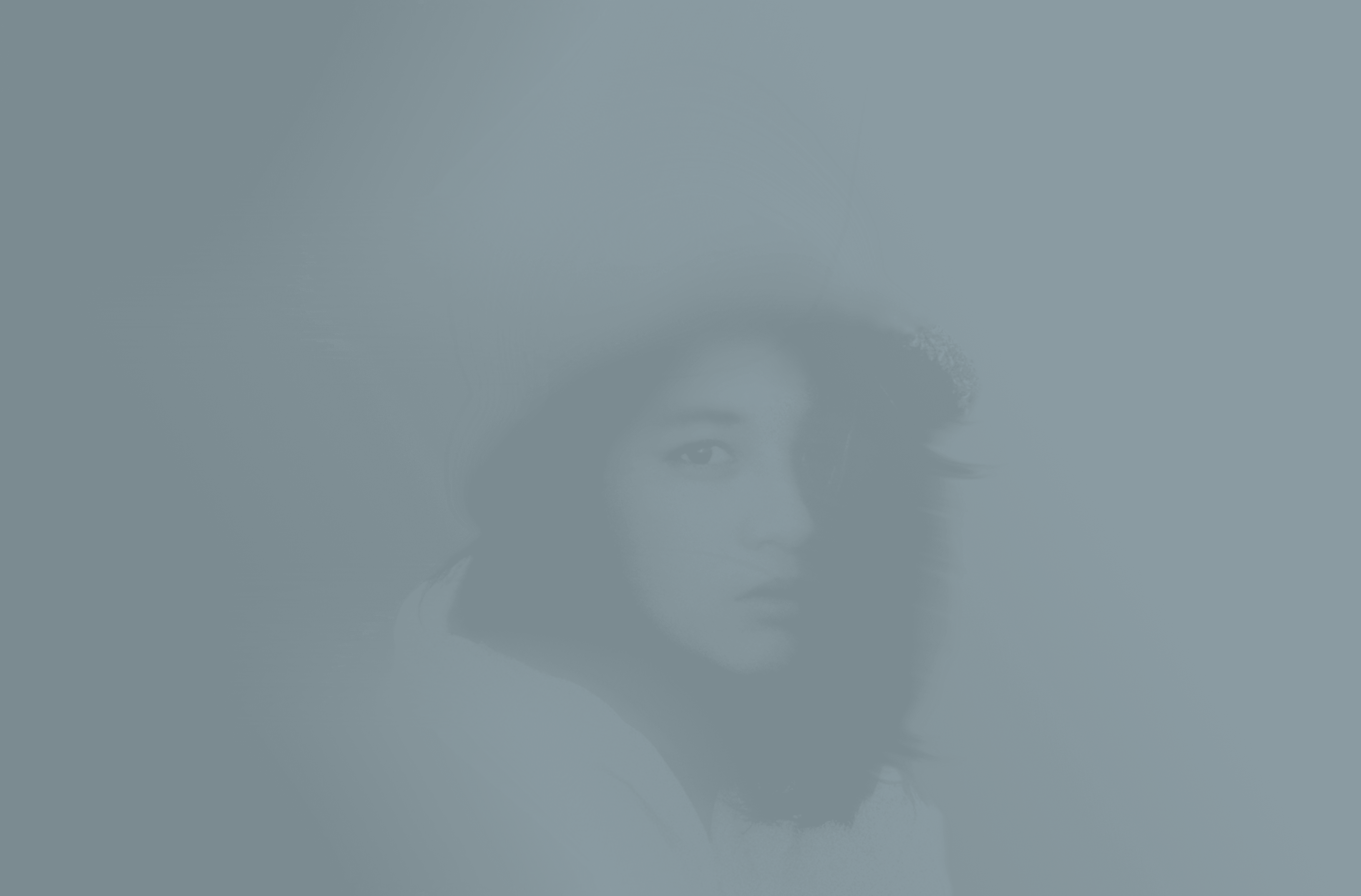
dewybie
Designing a Skincare Brand Rooted in Softness, Confidence, and Effortless Glow

Overview
Dewybie is a skincare brand built around one core idea: effortless radiance. The goal of this rebrand was to transform Dewybie into a modern, emotionally resonant beauty brand that reflects softness, confidence, and purity—while standing out in a saturated skincare market.
Grounded in the philosophy of “Stay Dewy Everyday,” the brand embraces natural glow over heavy transformation.
The Challenge
The original brand lacked:
A clear emotional positioning
Visual consistency across touchpoints
Distinctiveness in a competitive skincare space
The challenge was to create a brand that feels:
Soft but confident
Minimal yet memorable
Premium but approachable

Strategy
We defined Dewybie around four key brand pillars:
Pure Glow
Calm Softness
Soft Modernity
Effortlessly Radiant
This positioned the brand not as corrective skincare—but as restorative, gentle care that enhances what already exists.
Outcome
The rebrand transforms Dewybie into a brand that:
Feels emotionally connected, not just functional
Stands out through soft minimalism
Communicates confidence without harshness
Builds a recognizable and scalable system

Brand Identity
Logo System
The logo was designed with a refined serif style to balance femininity and modern sophistication.
Primary wordmark: elegant, soft contrast serif
Secondary mark: “db” icon for scalability
Flexible across product, digital, and social
The system ensures clarity even at small sizes, particularly for favicons and avatars.
Color System
A warm, skin-inspired palette was developed to evoke softness and glow:
Charcoal: #2A2A2A (grounding)
Cream: #F9DDBF (warmth)
Gold: #F6C744 (radiance)
Blush tones: #F4C3C6, #FF85AA (femininity & vitality)
Supporting tones expand the system for depth and flexibility across layouts.
Insight:
Instead of sterile “clinical skincare,” the palette leans emotional, human, and sensorial.
Typography
The type system balances elegance and readability:
Cormorant → Headlines (luxury, editorial feel)
Outfit → Body (clean, modern clarity)
This pairing creates contrast between:
Emotional storytelling (serif)
Functional communication (sans-serif)
Voice & Messaging
Tone of voice is:
Calm
Empathetic
Assured
Example direction:
“We restore your skin’s moisture balance and reveal a luminous glow—no heavy layers, just gentle care.”
The brand speaks with the user, not at them.
Overview
Dewybie is a skincare brand built around one core idea: effortless radiance. The goal of this rebrand was to transform Dewybie into a modern, emotionally resonant beauty brand that reflects softness, confidence, and purity—while standing out in a saturated skincare market.
Grounded in the philosophy of “Stay Dewy Everyday,” the brand embraces natural glow over heavy transformation.
The Challenge
The original brand lacked:
A clear emotional positioning
Visual consistency across touchpoints
Distinctiveness in a competitive skincare space
The challenge was to create a brand that feels:
Soft but confident
Minimal yet memorable
Premium but approachable
Strategy
We defined Dewybie around four key brand pillars:
Pure Glow
Calm Softness
Soft Modernity
Effortlessly Radiant
This positioned the brand not as corrective skincare—but as restorative, gentle care that enhances what already exists.
Outcome
The rebrand transforms Dewybie into a brand that:
Feels emotionally connected, not just functional
Stands out through soft minimalism
Communicates confidence without harshness
Builds a recognizable and scalable system
Brand Identity
Logo System
The logo was designed with a refined serif style to balance femininity and modern sophistication.
Primary wordmark: elegant, soft contrast serif
Secondary mark: “db” icon for scalability
Flexible across product, digital, and social
The system ensures clarity even at small sizes, particularly for favicons and avatars.
Color System
A warm, skin-inspired palette was developed to evoke softness and glow:
Charcoal: #2A2A2A (grounding)
Cream: #F9DDBF (warmth)
Gold: #F6C744 (radiance)
Blush tones: #F4C3C6, #FF85AA (femininity & vitality)
Supporting tones expand the system for depth and flexibility across layouts.
Insight:
Instead of sterile “clinical skincare,” the palette leans emotional, human, and sensorial.
Typography
The type system balances elegance and readability:
Cormorant → Headlines (luxury, editorial feel)
Outfit → Body (clean, modern clarity)
This pairing creates contrast between:
Emotional storytelling (serif)
Functional communication (sans-serif)
Voice & Messaging
Tone of voice is:
Calm
Empathetic
Assured
Example direction:
“We restore your skin’s moisture balance and reveal a luminous glow—no heavy layers, just gentle care.”
The brand speaks with the user, not at them.


